
^_^ thank you


^_^ thank you


Yes! One easy/good one to use is https://webaim.org/resources/contrastchecker/ It lets you pick two colors, and you can even use the eyedropper tool in their Color Picker box to select a color right off your screen. Then it’ll tell you the Contrast Ratio of the two selected colors. Higher is better. It will give you a pass/fail for WCAG AA and AAA (two levels of web accessibility standards). I just now checked the red and green from the linked map and it had a ratio of 1.3:1 which is a fail for both AA and AAA.
Some websites (like Trello) give accessibility options to skip colors altogether, and use patterns (cross-hatch, polka-dot, etc.). But in general, going for a high enough contrast ratio should be good enough. I’m a web dev as well and we just run everything through one of those WCAG tools (I believe we’ve been using the WAVE browser plugin) and fix it until it passes. :) But, being the colorblind one on the team, I can often just be like “uhmm, that one ain’t gonna work.” lol.
btw sorry I got so spicy in my initial comment. I really wanted to see the map. :P
Edit: Another reply to my comment had a link to a more colorblind-friendly version of the map, with red and blue instead of red and green. Much clearer to my eyes. I eyedropped those two colors into that webaim checker, and I was surprised to see it also failed quite badly on the color contrast! For example you wouldn’t want red text on a blue background (unless it was a bright red and dark blue, or vice versa). But for map colors, well… I guess that goes to show that for colorblind checking you have to use a little common sense and know what the most common no-no combos are (red/green seems to be the most common). I checked the accessibility docs at my work just now and we sometimes use this site to check what a site looks like under various types of colorblindness: https://www.toptal.com/designers/colorfilter


oh that’s so much better! thank you!!


Wtf are those colors, jfc… How bout a hand for us colorblinds.


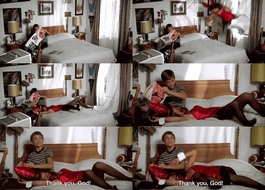
It’s from the movie Animal House. :) One of my favorite scenes ever (because who hasn’t been that kid? lol).


Can we get that in writing?


I read it as KAMALA CHADS


Wow. I would be nosy too. :-D


shouldn’t it say “Florida man guns down…”?
oooh those are bringing up some serious childhood arcade memories.
I loved Zaxxon! I gotta see if I can play that on PC.
Totally agree with this! Same thoughts about Spider-Man too.


LOL I came in to post similar.


Maybe this explains the sudden burst of Star Wars content in Rocket League?


It’s like that old episode of Curb Your Enthusiasm, where Larry finally gets with the dream girl (the one his wife gave him a “free pass” for if he could somehow manage to woo her)… and she invites him into her room… and on her bedside table is a framed photo of Dubya.


Anathem is one of my top faves!


I know right! It’s kind of unpalatable.
:'( I feel ya.