EDIT: This is now released.
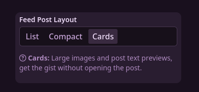
Hey! I’m almost done with a new feature and was looking for some feedback. I’m adding alternate post layouts for when viewing posts in a feed. There’s a new setting for it:

(List is the default, the only style until now)
Card layout shows the post’s image at full height, and the first few lines of the embedded description/post content (got some of the ideas from Sync).

Compact Layout uses smaller thumbnails and fonts to fit a bit more on screen.

With this I’m also working towards mobile support. You’ll find things generally work a bit better now with this.
Anyways, let me know how things go, if you find any bugs, or if you have any other feedback.
You must log in or # to comment.

